Impressive advertising design is not an easy work due to the high artistic, creative and subtle color coordination demands. Designbold will offer you a perfect design tool so that you can easily create the banner in accordance with 6 tips to make impressive graphic designs for advertisements below.
1. The combination of pictures and words
There are four criteria to grasp when combining words and images in a banner
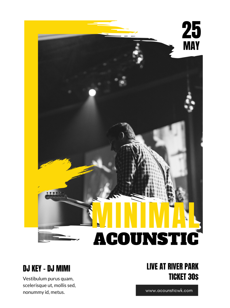
- ”A picture is better than a thousand words” is right only if the picture is eye-catching and has good quality.
- Limit using backgrounds that has too many patterns or too many highlights and colors because it easily makes text obscured.
- In the case of prominent / detailed backgrounds, draw out shapes to overlap.
- Typography with simple background, lessening texture is also an interesting choice.
 2. Using photos of human and product wisely
The characters in the banner need to be stylish and have great facial expression to represent your brand. However, if you are advertising to sell a particular item as a mobile phone, you should only focus on the product you are promoting.
3. Use original images and arrange the layout wisely
To highlight the discount information, you should re-arrange the layout or change the size, letter color to attract the attention of viewers. In particular, the text block or text colors that need to be highlighted often have the same color as the color of one of the main objects in the selected background with the aim to creating a certain link for your banner.
4. Offer many benefits
Due to the 20% rule, your ad may be subject to content restrictions and may not offer all promotion information. However, if your product or service has many benefits that can not be squeezed into a single ad, you can create multiple same versions. Put them in a carousel ad format, they will work together with the same advertising function. In this way, you can convey the myriad of messages and benefits of the product along with the various descriptive images.
5. Focus on 5 special words
Advertisers believe that there are 5 words you should put in the banner if you want people pay attention: ”you, because, immediately, latest and free”! Use a text box or contrasting colors to highlight the words. Surely, your banner will gain attention right from the first glance.
6. Where to place logo on your banner
Because text overlay is limited, using a logo can help you convey the key message and make the products resonate with your brand. The logo should be placed in an empty corner. You should also limit placing the main objects such as text, drawing blocks, images at the center because they will overshadow the logo.
Now you have known 6 tips to make impressive graphic designs for advertisements. If you are trying to design stunning advertisements, let DesignBold help you. It is a professional online design tool with which anyone can make great designs just by simple and easy-to-do steps. Just try it!

