Bold Color Palettes: How to Make Your Designs Stand Out in 2025
Color is one of the most powerful tools in design. It has the ability to evoke emotions, capture attention, and influence decisions. In 2025, bold color palettes are dominating the creative industry, helping brands make strong statements and differentiate themselves.
At DUYTHIN.DIGITAL, we understand the importance of visual impact. Whether you’re a graphic designer, marketer, or business owner, using bold colors can enhance your brand’s visibility and recognition. In this guide, we’ll explore how to use bold color palettes effectively to create stunning designs.
1. What Are Bold Color Palettes?
A bold color palette consists of highly saturated, contrasting, and striking colors that demand attention. These palettes often use vibrant hues to create a memorable and dynamic aesthetic.
-
They work well in branding, marketing, web design, and advertising.
-
Bold colors can evoke strong emotions such as excitement, energy, and confidence.
-
When used correctly, they can increase engagement and conversion rates.
“Color is a power which directly influences the soul.” – Wassily Kandinsky
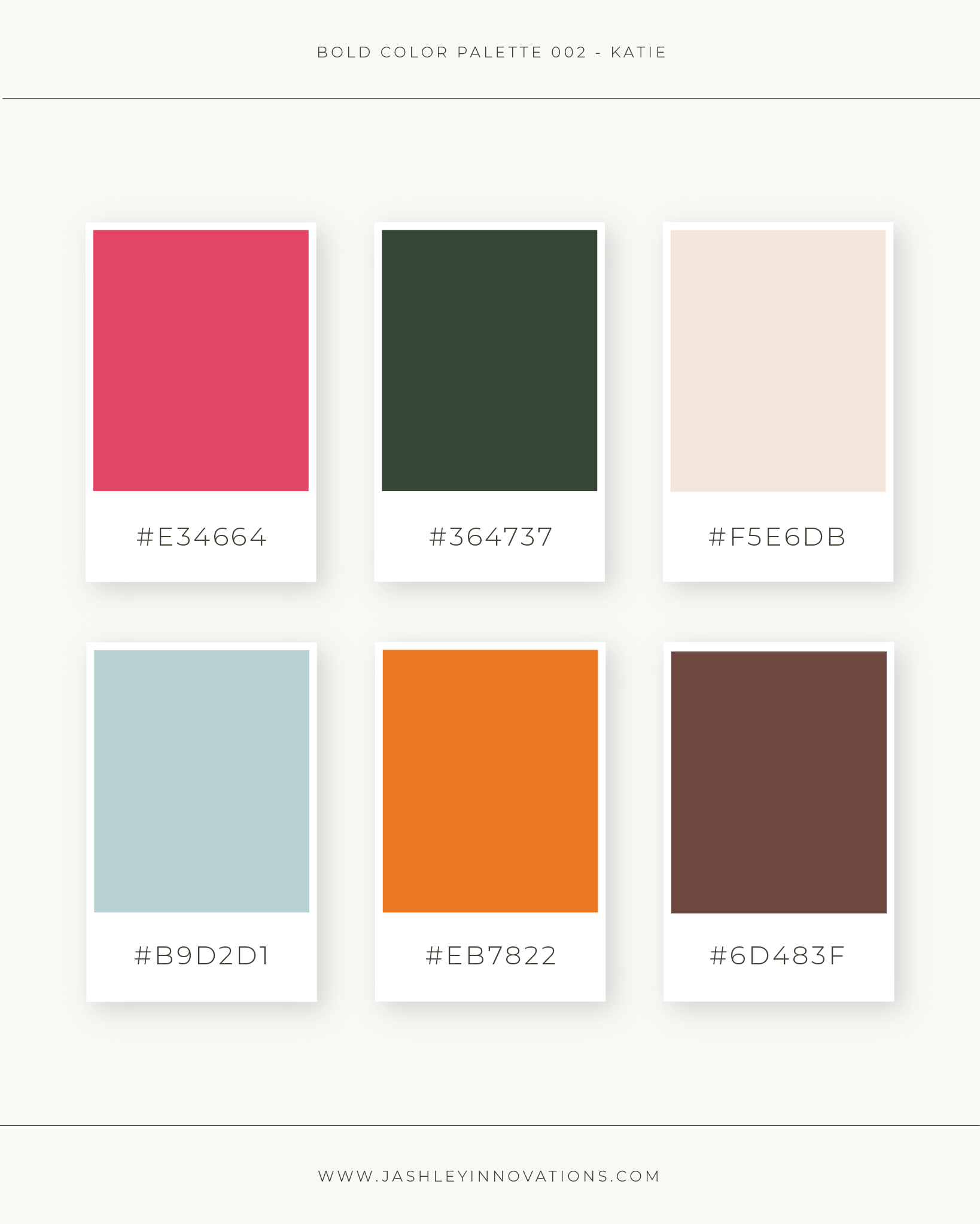
Here’s an example of bold color combinations:

2. Why Bold Colors Are Taking Over in 2025
In recent years, brands have moved away from muted and pastel tones, embracing vibrant, striking colors to stand out. Here’s why bold colors are trending:
-
Increased Digital Competition – With social media flooded with content, brands need bold visuals to catch users’ attention instantly.
-
Psychological Impact – Bold colors create a sense of urgency, excitement, and confidence, making them perfect for marketing campaigns.
-
Improved Brand Recognition – Companies using vibrant color schemes have a higher recall rate, making them more memorable.
Many global brands like Spotify, McDonald’s, and Nike have shifted to bold, high-contrast palettes to strengthen their visual identity.
3. How to Choose a Bold Color Palette
When selecting a bold color palette, you need to ensure harmony and balance. Here’s how to do it effectively:
✅ 1. Use the 60-30-10 Rule
This classic design principle helps maintain balance in bold designs:
-
60% – Dominant color (background or primary elements).
-
30% – Secondary color (supporting visuals).
-
10% – Accent color (highlights and call-to-actions).
✅ 2. Pick High-Contrast Colors
Contrast is key when using bold colors. Here are some high-impact combinations:
-
Red & Yellow – Energetic and attention-grabbing.
-
Blue & Orange – Strong yet harmonious contrast.
-
Purple & Green – Unconventional and creative.

✅ 3. Consider Brand Personality
Different colors evoke different emotions. Choose colors that align with your brand’s message:
-
Red – Passion, energy, urgency.
-
Blue – Trust, reliability, professionalism.
-
Yellow – Optimism, creativity, happiness.
Tip: Use tools like Adobe Color to experiment with bold color combinations.
4. Best Industries for Bold Color Palettes
Not all industries suit bold color schemes, but for certain brands, they work exceptionally well. Here are some sectors where bold colors thrive:
Entertainment & Media
-
Netflix, MTV, and Spotify use vibrant hues to build excitement and brand recognition.
-
Bright colors create an energetic and youthful appeal.
E-Commerce & Retail
-
Amazon and eBay incorporate bold colors to highlight discounts and call-to-actions.
-
Red and orange are common in fast-paced online shopping environments.
Tech & Startups
-
Companies like Slack, Dropbox, and Figma use bold color palettes for a modern, innovative look.
-
High-contrast UI design improves usability and visual impact.

Fact: 90% of first impressions are based on color alone!
5. How to Use Bold Colors in Design
Using bold colors effectively requires strategy. Here’s how to integrate them into your branding and marketing:
1. Website & UI Design
-
Use a bold background with contrasting text for readability.
-
Highlight call-to-action (CTA) buttons with striking colors.
-
Ensure accessibility by testing contrast ratios.
2. Social Media Graphics
-
Bright colors increase engagement rates.
-
Use a consistent color theme for brand recognition.
-
Keep text legible by balancing saturation levels.
3. Logo & Branding
-
A bold logo helps instant recognition (think of McDonald’s golden arches or Spotify’s neon green).
-
Stick to 2-3 bold colors to avoid visual clutter.

Tip: Pair bold colors with neutral tones to maintain balance!
FAQs About Bold Color Palettes
❓ Why are bold color palettes so popular now?
Bold colors capture attention quickly, making them perfect for branding, advertising, and digital content in today’s competitive landscape.
❓ Can bold colors work for professional brands?
Yes! Many corporate brands now use bold accent colors in websites, presentations, and logos to modernize their look.
❓ How do I ensure my bold color palette is not overwhelming?
Follow the 60-30-10 rule, use neutral backgrounds, and ensure high contrast for readability.
❓ Which color combinations are most effective?
Some powerful bold combinations include:
-
Electric blue & neon orange (modern and futuristic).
-
Hot pink & deep purple (fun and playful).
-
Lime green & black (high contrast, edgy).
Final Thoughts: Stand Out with Bold Colors
Bold color palettes dominate the design world because they create impact, evoke emotions, and improve brand recognition. Whether you’re designing a website, logo, or marketing campaign, using vibrant, high-contrast colors can elevate your brand and captivate audiences.
Want to automate your social media visuals and branding? Let DUYTHIN.DIGITAL help you create stunning bold color designs with AI-powered automation tools!


