 Master the principles to become a professional designer
Any industry has its own principles, and so does design. If you want to become a professional designer, you have to know the following 9 basic design principles. Now, let’s start!
1. Do not forget the Spacing
A post with good content but poor kerning will not ever be successful. Spacing is a very important skill in typography that every designer must take notice of.

Suitable kern
Kerning the texts is to adjust the spacing between characters so that the characters in the post are arranged neatly, easily to read. It helps the readers understand the information more easily.
2. Classify the content clearly
If you classify content clearly, you can convey the message more effectively and highlight the most important content that you want to viewers to perceive.
Adjust the font type, size, colors and apply special effects or insert a border. It helps the readers understand the main content even if they only flick through the article. Besides, wisely-arranged content can also attract readers from the beginning to the end of the article. Thus the classification of content is one of the 9 design principles that you should never break.
3. Using the grid system
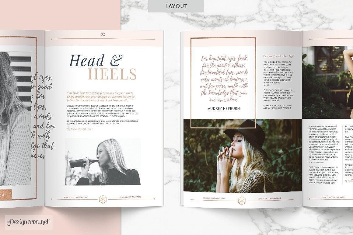
 Choose a grid design for neatly streamlined content
If you use grid systems in graphics, any of your designs will organize neatly, tidily and clearly. The information is focused, and the purpose of the content is also clearly defined. It helps design elements to be tightly linked which creates a clean layout.
4. Design should be appropriate to the targeted audience
You have to see the purpose of your design to decide the concept of your design. Then you can design with the most appropriate and fit the taste, preference of the targeted audience.
Remember that no matter how beautiful your design is, it will fail if it cannot express the main idea and interact with readers.
5. Use appropriate colors
If you want your design to look beautiful, you have to practice using the right color. The color scheme of the overall design must be harmonized in terms of the text color, background color, image color so as to create a nice impression. Do not use a lot of colorful colors to make a highlight.
 Using proper background color and letter color
You should not let the similar colors stand close together. Let’s take a simple example in the yellow background, you choose white or light yellow letters, it is not likely to be legible.
6. Do not transform the size the graphics unproportionally
If you choose to resize the text or image, please remember to keep the fixed ratio between the width and the length to avoid the distortion that make your design become unprofessional and non-aesthetic.
7. Avoid using multiple typeface on the same page
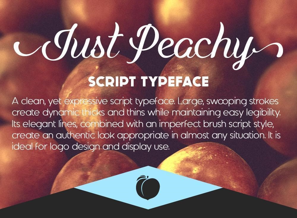
 Use fonts that match in the same page
When you use too many typography on the same page, your design will become messy. It makes the reader feel confused. It is often recommended that you should use up to only 2 fonts in one design.
8. Choose your own design style
Don’t try to copy the style of other famous designers. That will not help you in your design purpose, even worse, it can cause the undesirable impression on your design. You should choose your own styles, you can learn from or take inspirations from others but don’t be dependent on them.
9. Use the most suitable design tool
This is considered to be the most important principle out of these 9 design principles. As Adobe Photoshop helps you edit and work with rasterized images, it means you should be careful or else your output, whether digital or print, can be pixelated. If you have a logo or print design you should use Adobe Illustrator which is specialized in the vector object. In addition to making journals, books you should choose to do on Adobe InDesign.
On the other hand, if you are an amateur or a non-designer, choosing an online design tool with ready-made templates and layouts would be a smart choice to make your very own design quickly and cost-effectively.
The 9 design principles that cannot be broken above will help you become a professional designer and have the beautiful designs. If you still have questions, please visit DesignBold Academy for more information. Especially try using quick design feature of DesignBold to create stunning visuals.

