For those who are short of time, there’s always online letterhead maker – like DesignBold, where there’re numerous professional, easy-to-use letterhead templates for you to choose from.
However, if you do have the time and capability, why not try and make one of your own? It’d be more valuable and meaningful this way, after all! With just a little inspiration, which can be found right below in this article, you may wind up with a professional, striking letterhead design representing your brand!
Be Improvised with Space
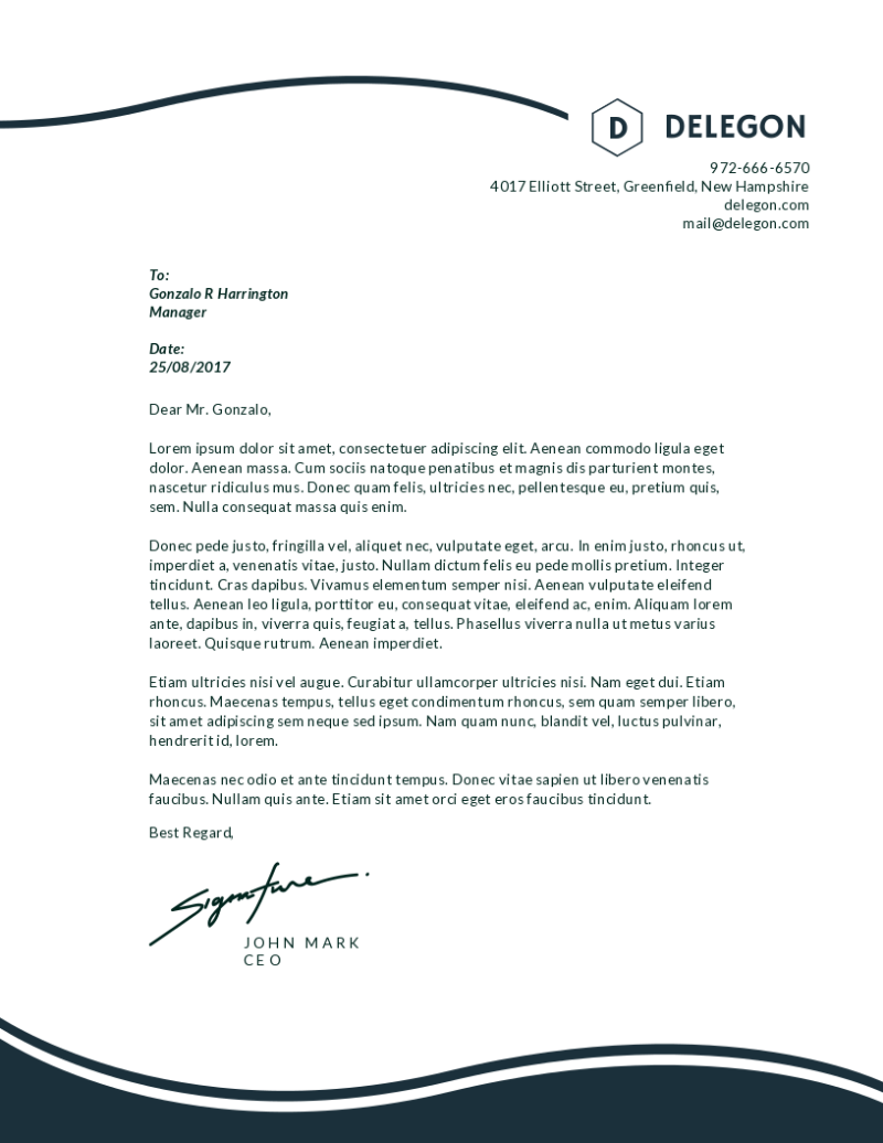
There’s no concrete rule when it comes to the placement of letterhead designs, per se. As such, you don’t need to put the letterhead at the top of a page like in most cases. Instead, there’re actually many designers have made optimal use of the sheet’s all four sides to fill in additional information (e.g., location, contact details, and even the business tagline, etc.).
 Signature
Apply your own signature on the design gives your letterhead a unique, highly personalized appearance. This style suits for a business and personal stationery incorporating your name. As your signature is distinctive, such a fashion is best to ensure that your letterhead design won’t be seen anywhere else!
 Photograph
Another way to personalize your letterhead is to use your own pictures. Why not pick one in your professional photo album to bring out your letterhead? – Your artistic photography can elevate your business identity from subtle to sufficient to striking!
 Keeping Things Simple
You know, your letterheads don’t have to be too fancy or intricate in order to capture readers’ attention, for creativity can be found everywhere actually, even in the simplest letterhead designs. If you find the ornate is too distracting, opt for the basics with plain colors to make a clean letterhead.
But this doesn’t mean simple letterheads with colors aren’t special. Try combining two accent shades like black and white, light grayish-blue and dark navy, or navy and blue cream on a spacious layout, etc. then you’ll see how eye-catching and stylish they are. Timeless combinations such as these work well on any design of letterhead as they contribute to the elegance and professionalization of your artwork.
 Watermark
Over 90% of people agree that the visual components of a product are the most persuasive factor in motivating their purchasing decisions. So, exploit this to your advantage and focus on using striking (but still very classic) color palette rather than sophisticated details.
Here’s another subtle way to catch people’s attention to your business without taking up much space on the document: put a watermark in your letterhead design. This fashion is suitable for those who like styles that are simple yet still able to show off the design on a distraction-free page.
The watermark keeps a white page from being too plain as it is the page’s background image. At the same time, this watermark should have enough contrast and shouldn’t be too transparent so it can both offer some visual interest and is available for people to read, print, or write on.
 Elaborate Fonts
There’s a thoughtful and curious sense in letterheads that have elaborate fonts incorporated on top that will sure delightfully draw any reader’s eyes. The particular trait of such fonts is that they have exaggerated swishes that can imply the letterhead designer’s creativity.
 Implicative Picture
With this particular style, designers will include an image suggesting something about the business and is related to the supposed audience. The plus points of this style are that it makes inventive use of space (both positive and negative) with a color palette that is usually high-contrast (blue and white, red and white, yellow and red, etc.) for more eye-catching effects.
 Use Icons
Icons are useful to express your brand as well as your brand logo. There’re numerous such kinds of visual to add to your messages. A letterhead using icons as the logo is a bright way to describe your services, products, and engage prospective clients with your content.
 Gold for Luxury
Metallic colors, especially gold and rose-gold, when applied on any project, always add to it a classic touch besides highlights an indescribable luxury and sophistication. The artful combination of gold lettering fonts on a floral, elegant watermarked background will pose an amazing representation of stylishness and refinement. Such a fashion of letterhead is most often used by beauty bloggers and lifestyle brands.
 Seasonal Letterhead
Even Starbuck has seasonal beverages and their matching cup designs – for which many people willingly queue up for hours. So, why not bring a delightful surprise to your clients with creative letterheads that are changed according to the seasons and festive holidays?
 Smart Graphics
You can cleverly display your services or motto with moving features like arrow-shaped symbols. For example, if the business’ motto is about stability and reliability, then no image is better to reflect such meanings than a row of arrows positioned like vectors pointing to the brand’s logo. Isn’t it a subtle, smart way to highlight the branding?
 What About the Other Side?
The back side of a professional letterhead is also noticable. Because, instead of leaving it blank, adding something on the reverse side will give off a sense of thoughtfulness with such an act of extra appeal. You can add a small symbol, solid color, etc. but entrepreneurs usually use their own logomark to maintain consistency.
 Color the Border
Again, if you’re into simple fashion and don’t want too much (if any) intricate decorations in your letterhead, then splash some colors to its border! The shades you choose can reflect your personality. For example, pick a bold color if you want your message to be especially striking; or if you want something subtler, then charcoal or gray is best for a simple border.
 We have just gone through all 13 examples of creative letterhead designs. Haven’t found your perfect fit? Explore more beautiful templates on DesignBold and customize your own now!


