
A blog graphic can benefit your brand a great deal – spreading your brand, attracting new customers, maintaining the regular ones, etc. These can be easily achieved with a neat and well-designed site updated with good content. That is, if the arrangements of your blog are scientific and professional. Your content could be excellent, but if the overall design of your blog is difficult or too boring to read, then your guests may very well flee before even reading a single heading.
Check out the most common blog graphic design mistakes that website owners and bloggers often make if you want to stay on brand instead of driving your blog-visitors away!
Inappropriate Layout
The line’s length and height do matter. To be more specific, readers often get tired with lines which are too long or too short. In fact, they can even lose their track when they’re busy scanning for the beginning of the next line. On the other hands, with too-short lines, readers have to follow unnatural skimming patterns and reading rhythms.

As for the line’s height, they affect blog usability as well. If the line height is too tall, it may reduce your content’s cohesion, and at the same time, create an extra, unnecessary gap for a reader’s eye to skim over. Meanwhile, too-short line height will make the paragraphs look busy and cluttered. It makes the reader’s brain have to work harder to both distinguish letters and recollect meaningful words, terms, and phrases.
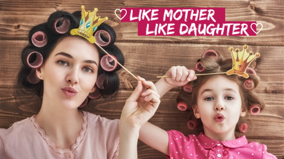
Lack of Imagery
A post not including any or far too few images is a boring post. Leaving out pictures from your blog post is a mistake which is, fortunately, becoming less common. This is because bloggers keep getting comments from their spectators – regarding that they want to see some kind of graphic media included in a blog post – and only read their blogs accordingly.
Famous bloggers pointed out that blog posts including illustrative pictures have better chances (up to 94%) in getting more traffics than blogs without. Blog watchers like images for these following reasons:
- Give the eyes a break after some-hundreds words
- Break up the paragraphs
- Ignite more interest in readers
- Catch a reader’s eye and attention before they read the post
Social Media Plugins
Even if people find your post interesting and want to spread it, they cannot do that if they cannot find social share plugins. That’s either because you didn’t add them, or they’re not visible, or your readers cannot find the one they need.

So, if you want your post to be widespread, make these buttons more obvious by displaying them clearly at the top or bottom of every blog post. Aside from looking nice, big, and colorful, you should also include a count – regarding how many times a blog post has been shared in each of the buttons.
Visual Clutter
Including visual variety to your blog content can enhance your audience’s reading experience. But in most cases, you may get backfire if overdoing it. That’s because visual clutter can cause difficulty to read, making it much harder and longer for readers to absorb and comprehend information.
Therefore, you should restrain yourself when formatting the texts by using underlines, italics and bold in moderation to provide visual cues or convey emphasis. Overused formatting clutters the content and decreases the emphasizing effect of the text.
Low-Quality Imagery
Yet another picture-related problem that bloggers need to watch out! Pictures reflect your working style, especially if your business is photography-related. People won’t hesitate to assume that the services you offer are poor if the images illustrating your posts are inferior.
That’s why you should use pictures that aren’t pixilated, or that they’re weird colors tinted. That said, don’t use pictures that are so enormous either. Optimize your images, or they will slow down your web page’s loading speed. And, you know, not many blog visitors are patient enough to wait 10 minutes for them to appear while there are many other similar, faster loading posts out there to see.
Also, be careful if you use copyrighted photos if you don’t want to get sued for this.
Color Overused
Colors attract people’s eyes. But if you overuse them, they also make your blog appear like a puzzle set that viewers can’t decipher. So, don’t distract readers with a bunch of colors. Instead, make it easy for them by limiting the color scheme to only 3 primary shades maximum and 1-2 background shades for the cleanest results. This rule of thumbs is effective enough to evoke the philosophy of your brand and encourage blog guests to learn more about your business.
Choosing a color may not always be an easy ride, especially for those who are new in blog designing. You can first try making several samples of color layouts – those that you think can best represent the mood behind your brand until you can find the most suitable one. Stay focused on picking brand’s colors to synchronously feature across your blog page instead of bombarding viewers with uncoordinated shades.
Conclusion
Of course, mistakes are a common part of our life. It’s nothing terrible to make some errors from time to time, as long as you can learn from them to avoid them.
However, if setting up a blog isn’t your thing or if it costs you too much time to find an appropriate design, go to DesignBold. The virtual blog graphic maker can help you craft a standard blog with its many blog graphic templates. Your blog will surely become and remain an engaging site that will both please and attract more clients to your services!


