1. Simple and Bold Sans Serif Fonts
These typefaces first originated in the 18th century but were only popular in the 19th century. Today, with the rapid growth of digital tools in graphic design and printing, San Serifs dominate the web. Its modernity and legibility make it one of the most common fonts this year.
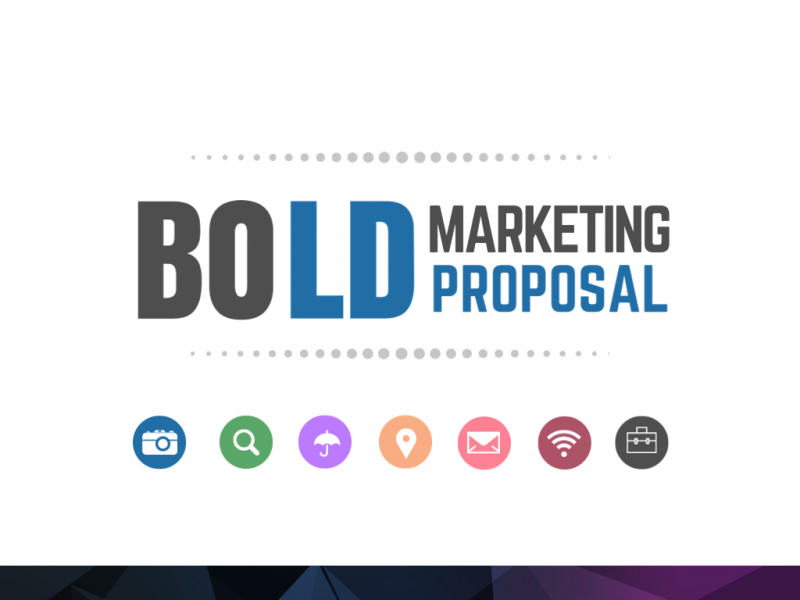
Sans Serifs are not in distinctive shape, but they have thick stroke widths, making them readable even in smaller font size or in low resolution. Therefore, they are being used widely across different marketing collaterals, from posters to logos and presentation slides.
2. Helvetica Fonts
Helvetica fonts have always been used by many brands for different purposes, from office emails to brochures, logos, posters, and other marketing materials. Its reliability will keep this font on the top of popular fonts list for 2018.
Its key elements remain while new, freshly elements are added to bring a modern look to this classic font. It’s versatile, legible, easy to use and thus a good fit for a wide variety of brands in different industries, from education to technology, from food to home care. This is certainly a not-to-be-missed font if you’re considering a font for your brand.
3. Geometric Fonts
The first Geometric fonts appeared in the 1920s. Nowadays, this uniquely modern font is chosen by many designers thanks to its simplicity yet legibility. Distinctively recognizable, this font has its own charm with clean, straight lines, squares, triangles, and round circles.
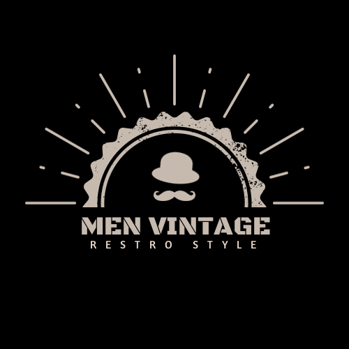
Geometric fonts have earned its popularity in the past few years and are expected to top the list of trendy fonts in 2018. Its modernity is the perfect font choice for designs of brands that are related to science, technology, engineering. Since it brings clarity from a distance to any designs, it’s particularly a good fit for logos, business cards and other corporate marketing materials.
Logo design using geometric fonts can be done by using online design tools, such as DesignBold. It empowers you to create stunning visual contents, from social media graphics to brochures and logos. All you need to do is choose your templates and your logo can be done in no time.
4. Vintage Script Fonts
These fonts usually bring its classic and artisanal appeal to the designs. It’s often used by brands that want to add a touch of nostalgia to their design work. However, it doesn’t mean that these fonts are hard to read. In fact, they can still retain its legibility for logos, brochures, posters and websites.

These decorative fonts tend to give the design a retro touch. That said, it should be chosen carefully to fit in with your brand characters. Aesthetic font and calligraphy font belong to this group and they’re often used by vintage brands.
5. Handwritten Fonts
Handwritten fonts are not a new trend, it has been used in recent years but its popularity still lasts till 2018. As personalized as every person’s handwriting, each handwritten font is custom-made. It adds an edge to any pieces of design and brings charms to posters and brochures. It can gracefully differentiate your logos, or other marketing materials, from your competitors.
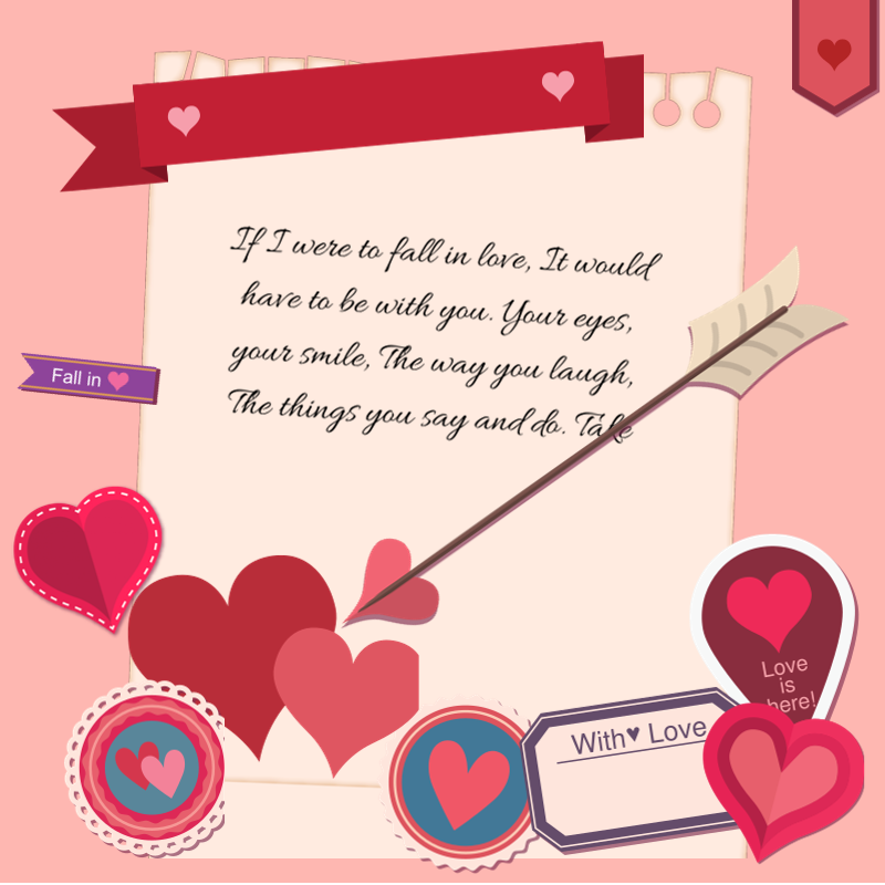
As handwritten fonts are truly distinctive, using them with caution is highly recommended. They’re usually full of characters, so it’s important to make sure that these characters match your brand identity. If your brand is conservative, handwritten fonts might not be a wise choice. If your brand is related to children, creativity services or fashion, handwritten fonts are probably a good choice.
6. Watercolor Fonts
True to its name, watercolor fonts look like they’re written by a painting brush with watercolors. This typeface often goes hand in hand with handwritten font and they do complement each other. However, watercolor font, true to its name, is more real in colors compared to handwritten font. Therefore, it gives a personal touch to the design.
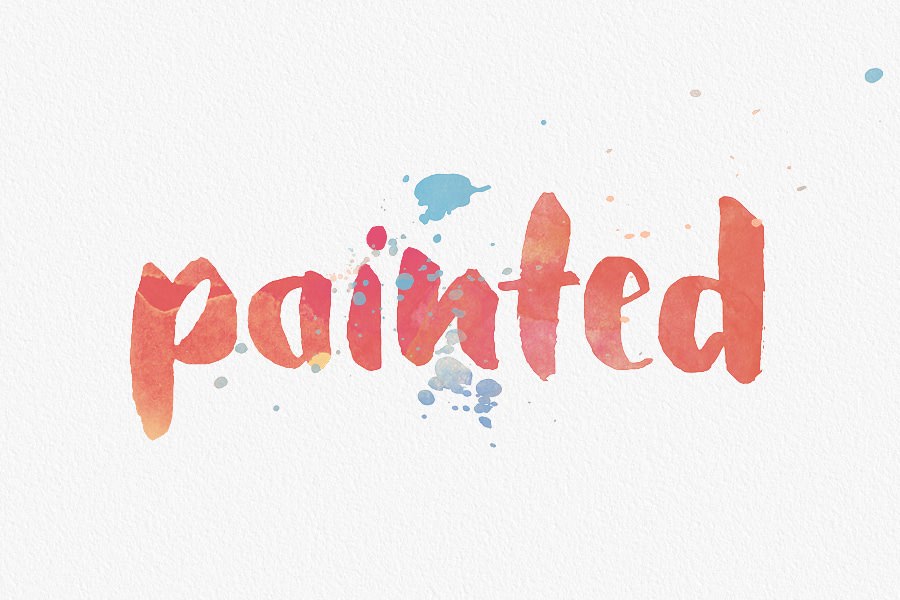
Though it might not have an edgy, bold look, this font is lively, colorful thanks to its authentic color tone. Watercolor fonts are friendly, dainty, delicate and thereby a good choice for feminine brands.
7. Colorful Fonts
While minimalist styles with black and white texts have been on trend in the past few years, colorful fonts have earned its reputation recently. In a harshly competitive market where many brands are all fighting for consumers’ attention, colorful visuals stand out. Colors cut through the clutter, create strong impressions for your brand messages.
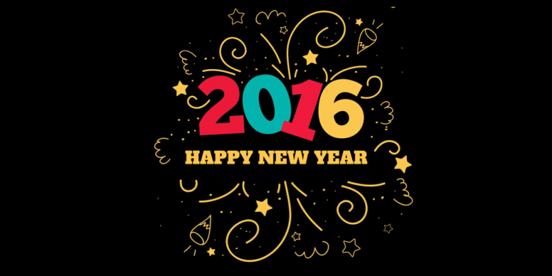
Colorful fonts add depth, dynamism and innovation to your design work. Bright font colors, if done right, can help to build brand identity and draw users to the design.
8. Gradient Fonts
We’ve seen designs with a gradient background in previous years. In 2018, gradient trend will enter the territory of typography. 2018 typography trends tend to move toward different kinds of effects right on the letters themselves rather than the background. Gradient fonts fit best with bold, large fonts on a monotone background.
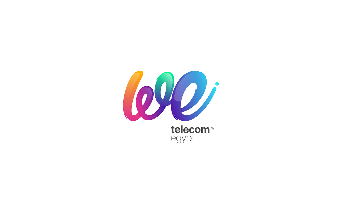
This is an interesting trend as it can create a three-dimensional effect on a piece of design. That said, if done right, the effects it can bring to your brand is pretty impressive.
9. Variable Fonts
As its name suggests, variable font is one font but actually looks like many fonts in a design. In other words, it’s one font with different characters. Modern technology makes it possible for one single font to behave like multiple fonts. Basically, this is done by identifying different variations within one font and then interpolating them.

Variable fonts are also called OpenType variable font. Jointly developed by four tech giants: Adobe, Apple, Google and Microsoft, this new font is expected to be a trend in 2018. The key reason is that it takes up very little space because it reduced file size and, hence smaller hard drive and web bandwidth. This means it’s one of the best choices for web design because it adapts to different types of readers’ devices. In today’s digital landscape of a widespread use of mobile devices, this font is expected to be the trend in 2018.
