There’s no way to deny the obvious importance of graphs to infographics, since most statistics are visualized through graphs. Well-designed charts can illustrate information in an engaging and easily comprehensible way. Meanwhile, infographics are visuals employed to communicate information. Infographics’ main duty is to break down complicated information and display it in such a way that it can be easily digested by anyone.
Don’t know which graph is best for your infographics? This article provides 5 most popular graph types people prefer to add to their infographic design.
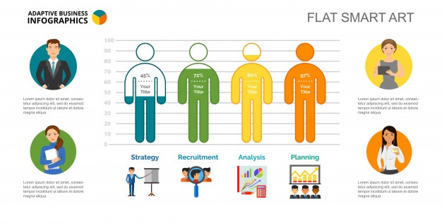
Icon Graph
As the name suggests, icon graphs are the graph made of icons. It can be in whatever form you like because it is freestyled pictogram. But keep in mind that icon chart is usually employed when you want to communicate a single info point, as it is inadvisable to display complex data.

Also, the icon you select and your infographic topic needs to be related to each other. For instance, if you want to put an icon graph to an infographic about car sales, you should use the car images instead of some random vehicles. Such a display would make the infographic more straightforward and distinct to the topic you’re imparting.
Line Graph
In and of itself, line graphs are the best choice for showing changes and time series data. Actually, its cousin the area chart is also great to carry out such a function. However, people opt for line graph more because it’s more flexible. With line chart, you can:
- Visualize trends in data over continuous space or time
- Compare changes among multiple groups of data in the same period of time
Line graphs are the most successful one in handling multiple data series and a bunch of data points. Most of all, it is one of the basic graphs and so anyone knows how to interpret it.

In infographics, line graphs are considered the most effective tool to show trends. Also, you can use “markers” sometimes to display data points.
Any line graph designer should be sure to:
- Use synchronous time intervals
- Arrange the time points go from left to right
Bar Graph
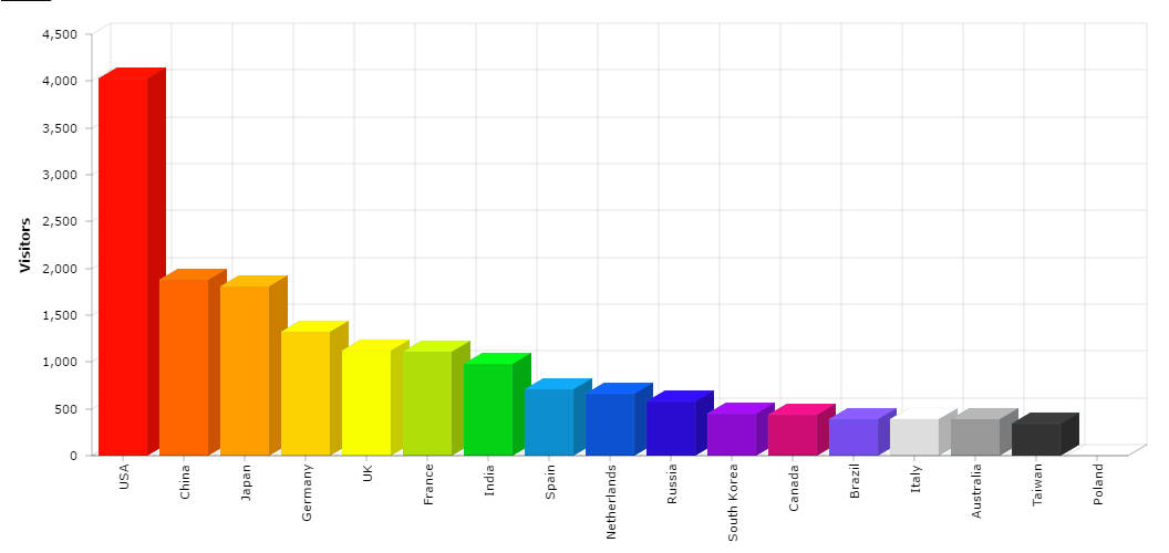
When it comes to diagrams for comparing other than two sets of data, a bar chart is an ideal choice. People use bar graphs to display differences or similarities among sections of a whole or among independent values.
A note about the bars: In bar graphs, the bar’s height or length is equal to the quantity represented within that category. These bars can be drawn horizontally or vertically. Either way, they work magically when you want to contrast the data/figures visually because it’s pretty easy for our eyes to detect the bars’ different heights.

So, when to draw the bars horizontally? – Horizontal bar charts are best used if the labels for each statistic point you happen to have are too long. With this arrangement, the graph allows extra room for each label and so it effectively eliminates the cases of viewers facing difficulty in reading vertical or angled texts.
Bar graphs are a noticeable way to get viewers to memorize information. In infographics, the traditional bars can be put on interesting looks. Creative bar graph designers can replace these boring columns with icons signifying the number of items in a data group. Also, graph developers opt to omit the X/Y axis in order to make the appearance of their bar graph simpler and clearer. Unleash your imaginations and have fun with the conventional bar graphs for your infographics!
Column Graph
As a very close cousin of the bar chart – column chart, is also used to compare independent rates. It’s fitting to use column graphs in an infographic to represent amounts like distance and units of time for they are displayed horizontally.

For the most part, these two graphing types can be used interchangeably for, on principle, the only different trait between column graphs and bar graphs is the horizontal–vertical difference. However, if you need to compare the difference in certain metric over time, you’d better do it with a column graph so that the time is displayed from left to right. Also, column charts are most useful when comparing less than five items. Pick the bar graph if the number is bigger than that to avoid visual clutter.
Pie Chart
Pie charts are quite often seen in infographics, as they are exceptionally useful when presenting percentages of a whole. It’s best to use this graph when your intention is to:
- Show differences within data groups based on one function
- Compare sections of a whole
- Convey a simple piece of info which can be broken down into fractions of percentages
On the other hand, a pie graph may not be helpful if your data is all about the same percentage, for the pie’s slices may not be strikingly different enough to detect.
In infographics, pie graphs come in a wide range of styles and variants. A pie chart is the easiest way to illustrate the part-to-whole relationships. When you’re designing it, try to make your pie graphs easy to read for the viewers by:
- Starting the first section at 12:00 and keep going clockwise
- Limiting the sections to a maximum of 7
- Organizing sections from greatest to least
Need Help?
If you already figured out what type of diagram you’ll use for your next infographic but still have no idea where or how to begin, then come to DesignBold! With its simplest and smartest of interfaces, DesignBold offers every graphing tool, including line graph maker and bar graph maker, to transform your ideas into pretty and logically visual content for infographics.

