You instantly get views the hour you upload a video on YouTube. Its amount is kind of a ruler to measure how high the video will be ranked on YouTube’s trending site. For many YouTubers, views also mean money. That’s why they try their best to keep their vlogs trending or getting more views. Achieving this will likely give your video a lift in the search results and, consequently, recommend it to more possible audiences.
But keep in mind that views and subs are obtained first and foremost from the general look of your channel, not from the appealing contents, which people only click on after deeming what is displayed outside is interesting enough.
This article will help you figure out how something as minor and basic as YouTube channel arts affect the traffic of your channel. The ultimate purpose is to make them engage with you just through some adjusts in your YouTube cover design.
Here are how significant they are and how you should correct them to attract more views for your video blog.
YouTube Channel Arts
About The Name
The YouTube channel art is also the banner – which is placed at the top of your YouTube page. Consequently, YouTube channel art is often called YouTube banner.
About The Roles
Your YouTube channel art is the most fitting space (besides the videos uploaded on your channel) to make a whole statement about the nature of your channel, yourself, and your company.
This banner is principally a YouTube’s version of the cover photo on Facebook. Its prominent place enables you to instantly make the first impression on visitors coming onto your page. And you already know how important a first impression is, don’t you? That’s why take especially care to create a really good one for your channel.

With the current layout of YouTube, a well-made channel art may even help to persuade new audiences to subscribe to your channel. Your page will appear more professional to any visitor – especially the newcomer if you display a good cover. As they think your contents are probably as okay as the fine look of your banner artwork, they’ll give your video a chance.
About The Dimension
The standard YouTube banner resolution is 2560 X 1440px – recommended by YouTube itself. Kind of huge, eh? But it has to be this way if you want your artwork to appear sharply and impeccably across different devices (e.g., TV, PC, mobile phone, tablet, etc.). Other than that, you must remember to keep important features within the “safe area” so that it won’t be cropped and so viewers can see what you want to show them.
YouTube Thumbnails
The first step to catch viewers’ attention is done with the intriguing banner. Now is the harder part – make a thumbnail in such a way that it can persuade potential viewers to click on the video.
Similar to the case where the banner is your channel’s representative, a thumbnail is a video’s representative as well.
Video thumbnails’ importance on YouTube cannot be underestimated. Generally, they can:
- Affect greatly concerning click-through rates
- Play the main role in branding your YouTube channel
That’s why fashioning a good thumbnail for your YouTube videos not only helps boost your brand, but it can also attract random visitors to your content.
Standard Thumbnails
As it is, your video thumbnail is typically the first thing that audiences see when skimming through the search results on YouTube. It helps people decide if they should click through, so make sure that it is of high quality always.
The recommended YouTube thumbnail resolutions are 1280×720px, and of .JPG, .PNG, .BMP, or .GIF format. Choose a picture accordingly and combine with a short text describing your video’s title.

Tailor Video Thumbnail
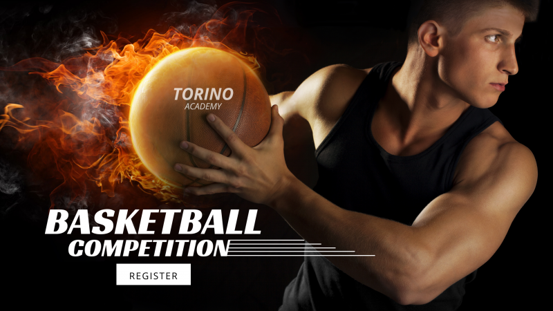
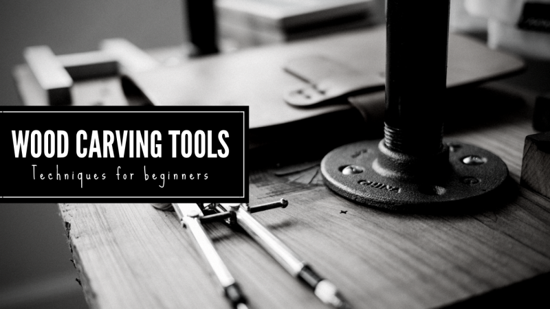
Your video thumbnail is the face of your video. So consider picking something that can really wow the viewers. Here’s a piece of advice – create an attractive thumbnail yourself, one that communicates what your vlog is about; Because grainy screenshots that YouTube randomly picked from the middle of a video just aren’t to-the-point, nor are they attractive enough, to persuade potential viewers to click on.
Use Captivating Images
Most people don’t have time to closely look at each video on YouTube because there’re just too many videos on a recommendation list. Viewers only spare a few seconds to inspect a video when their eyes are caught by a compelling enough thumbnail image.
Research pointed out that 90% of the top-played records on YouTube putting on a custom image for their thumbnails to attract potential viewers. The more appealing the YouTube thumbnail design looks, the higher chances your videos are clicked on. And, again, it can be achieved more easily when you upload and customize the thumbnail yourself, instead of choosing a YouTube’s auto-generated thumbnails.
Final Tip
Now that you have a grab about the significances of your YouTube channel art and thumbnails, it’s time to make or remake one!
Still don’t know where to start? Then let DesignBold give you a push. Your work of creating YouTube channel arts doesn’t even have to start from scratch. Just come, pick, and use our ready-made templates to create amazing covers that will bring out more sparkles for your YouTube channel.
There’re various high-resolution photos and useful, easy-to-use tools – which don’t require any technologic or design skills from users – to make impressive artworks that are guaranteed to catch anyone’s attention!

